2.8 KiB
2.8 KiB
First app
- StatelessWidget : base class of all the widget
- using const with constructor is recommended if it doesnt change often as it will executed during compile time and this improving performance
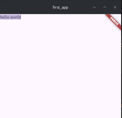
import 'package:flutter/material.dart';

void main() {
  runApp(MyApp());
}

class MyApp extends StatelessWidget {
  @override
  Widget build(BuildContext context) {
    return MaterialApp(
        home: Scaffold(
      body: SelectableText('hello world'),
    ));
  }
}
Appbar
  Widget build(BuildContext context) {
    return MaterialApp(
        home: Scaffold(
            appBar: AppBar(
              title: Text('Programming Knowledge'),
              backgroundColor: Colors.brown,
              bottom: PreferredSize(
                  preferredSize: Size(12, 24), child: Icon(Icons.add)),
            ),
            body: Center(child: Text("Hello World"))));
  }
Column and Rows
- These widgets are similar to flex layout in web development
- Column widget is same as flex-column means widgets inside it will be arranged vertically
- to make our widgets center both vertically and horizontally use mainAxisAlignment property of column should be
MainAxisAlignment.centerand if Column widget is taking whole screen then crossAxisAlignment property withCrossAxisAlignment.centerwould work. If column is not taking whole width then in the case wrap whole Column Widget as a value of child property of Center Widget - Row widget has similar properties like column with difference is that widgets inside it will be arranged horizontally
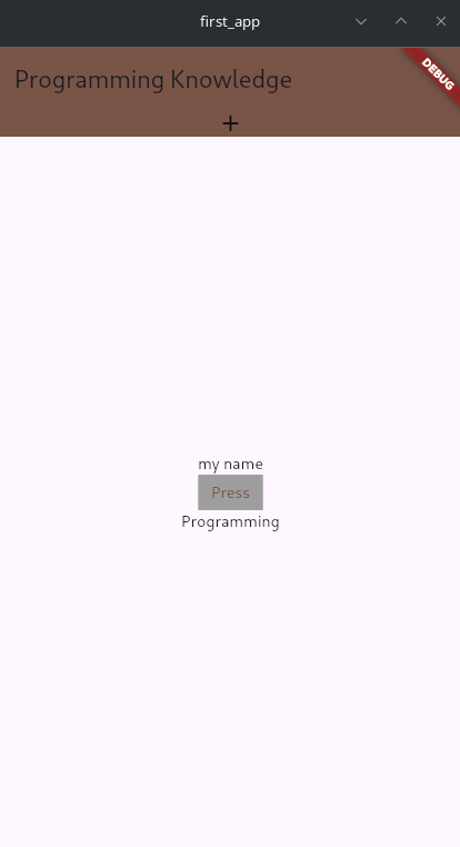
Widget build(BuildContext context) {
    return MaterialApp(
        home: Scaffold(
            appBar: AppBar(
              title: Text('Programming Knowledge'),
              backgroundColor: Colors.brown,
              bottom: PreferredSize(
                  preferredSize: Size(12, 24), child: Icon(Icons.add)),
            ),
            body: Center(
              child: Column(
                  mainAxisAlignment: MainAxisAlignment.center,
                  crossAxisAlignment: CrossAxisAlignment.center,
                  children: <Widget>[
                    Text('my name'),
                    TextButton(
                        child: Text('Press'),
                        onPressed: () => print('Pressed'),
                        style: TextButton.styleFrom(
                            foregroundColor: Colors.brown,
                            backgroundColor: Colors.grey,
                            shape: LinearBorder())),
                    Text('Programming')
                  ]),
            )));
  }