
15 KiB
Widgets
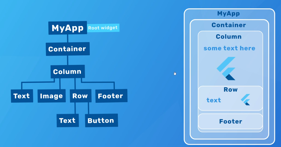
Text
   body: Center(
            child: Text(
          'Programming Knowledge\nProgramming Knowledge\nProgramming Knowledge\nProgramming Knowledge',
          maxLines: 3,
          style: TextStyle(
              backgroundColor: Colors.red,
              color: Colors.white,
              fontWeight: FontWeight.bold,
              fontSize: 30,
              fontStyle: FontStyle.italic),
        ))
RichText
- To provide different styling for indivual words in whole string thats why
TextSpanWidget is used to enclose word for different styling.
 body: Center(
            child: RichText(
          text: TextSpan(
              text: 'Programming',
              style: TextStyle(color: Colors.cyan, fontSize: 15),
              children: <TextSpan>[
                TextSpan(
                    text: ' Knowledge: ',
                    style: TextStyle(color: Colors.red, fontSize: 30)),
                TextSpan(
                    text: ' Flutter ',
                    style: TextStyle(color: Colors.green, fontSize: 20)),
              ]),
        ))
Buttons https://docs.flutter.dev/release/breaking-changes/buttons
- The FlatButton, RaisedButton and OutlineButton widgets have been replaced by TextButton, ElevatedButton, and OutlinedButton respectively. Each new button class has its own theme: TextButtonTheme, ElevatedButtonTheme, and OutlinedButtonTheme. The original ButtonTheme class is no longer used.
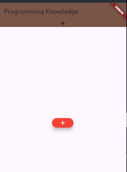
ElevatedButton
- buttons which are little elevated and when we hold it it gets flat.
- in following if onPressed is assingned null then button is disabled and color will be orange instead of red
        body: Center(
            child: ElevatedButton(
                onPressed: () => print('button pressed'),
                // onPressed: null,
                child: Icon(Icons.add),
                style: ElevatedButton.styleFrom(
                    foregroundColor: Colors.white,
                    backgroundColor: Colors.red,
                    elevation: 10,
                    disabledBackgroundColor: Colors.orange,

                )))
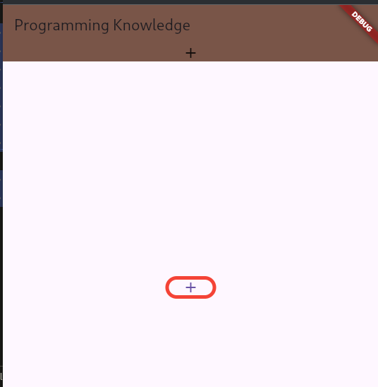
OutlinedButton
- button having a property related to borders where we can customize it as much as we want
- to remove border, style property of BorderSide widget should be
BorderStyle.none
    body: Center(
            child: OutlinedButton(
                onPressed: () => print('button pressed'),
                child: Icon(Icons.add),
                style: OutlinedButton.styleFrom(
                  side: BorderSide(
                      color: Colors.red, width: 5.0, style: BorderStyle.solid),
                )))
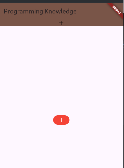
TextButton
  body: Center(
            child: TextButton(
          child: Icon(Icons.add),
          onPressed: () => print('flatbutton pressed'),
          // onPressed: null,
          style: TextButton.styleFrom(
            backgroundColor: Colors.red,
            foregroundColor: Colors.white,
            disabledBackgroundColor: Colors.cyan,
          ),
          onLongPress: () => print('button is pressed for long time'),
        ))
IconButton
- overlaycolor is a replacement of splash colour. with this there is a animation of overlay translucent color spashing from point of click to others like water
- earlier there was tooltip property but now to add tooltip, wrap button inside tooltip.
body: Center(
            child: Tooltip(
          message: 'description of the button',
          child: IconButton(
              icon: Icon(Icons.add),
              onPressed: () => print('iconbutton pressed'),
              style: IconButton.styleFrom(
                backgroundColor: Colors.red,
                iconSize: 40.0,
                // splashFactory:
                overlayColor: Colors.black,
                padding: EdgeInsets.all(20.0),
              )),
        ))
Ink class
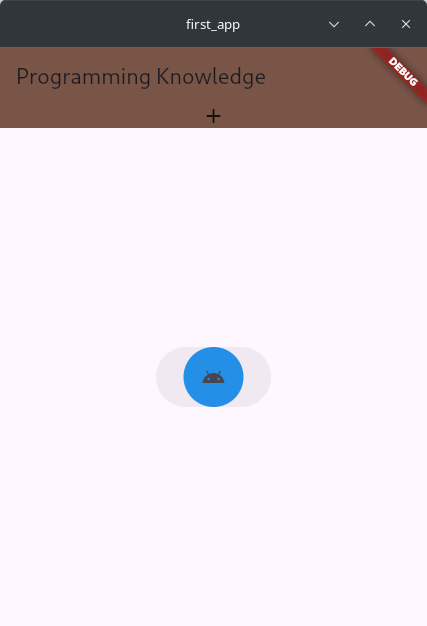
- A convenience widget for drawing images and other decorations on Material widgets so that InkWell and InkResponse splashes will render over them.
- As can be seen from the image, the rounded rectange button is actual button and is clickable area and ink is the circle
- color property can be either inside Ink widget or under ShapeDecoration but it can be only in one of them and if there is ShapeDecoration then it cannot be under Ink one and only in ShapeDecoration.
 body: Center(
            child: Ink(
                decoration: ShapeDecoration(
                  shape: CircleBorder(),
                  // shape: StarBorder(),
                  // shape: BeveledRectangleBorder(),
                  color: Colors.blue,
                ),
                // height: 60,
                width: 115,
                padding: EdgeInsets.symmetric(vertical: 45),
                child: IconButton(
                    icon: Icon(Icons.android),
                    onPressed: () => print('iconbutton of ink pressed'))))
FloatingActionButton and extended feature
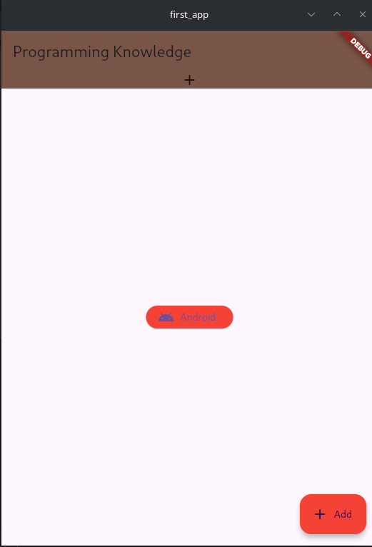
- We can have text and icon both in FloatingActionButton by using Row widget but its not the best case if its content inside is dynamic bcz fixed width needs to be protected.
- Colors.colorname ie MaterialColor property also have color darkness numbers too from 100 to 1000. by default its 500. 100 is lightest and 1000 is darkest.
- with icon method of ElevatedButton, we can have label too
 body: Center(
          child: ElevatedButton.icon(
            onPressed: () => print('ElevatedButton.icon pressed'),
            icon: Icon(Icons.android),
            label: Text('Android'),
            style: ElevatedButton.styleFrom(backgroundColor: Colors.red),
          ),
        ), // Center

   floatingActionButton: Container(
          width: 100,
          child: FloatingActionButton(
            onPressed: () => print('FAB pressed'),
            clipBehavior: Clip.hardEdge,
            // shape: RoundedRectangleBorder(),
            // shape: CircleBorder(),
            shape: StadiumBorder(),
            child: Row(
              mainAxisSize: MainAxisSize.min,
              children: <Widget>[Icon(Icons.add), Text('Android')],
            ),
            backgroundColor: Colors.red[600],
            tooltip: 'ToolTip FAB',
          ),
        )
- For dynamic length and to contain whatever inside it use
- inkwell is rectangular area of material that is responsive to touch
- material is widget that creates a piece of material.
     floatingActionButton: Material(
        color: Colors.red[600], // Set the background color
        shape: RoundedRectangleBorder(
          borderRadius: BorderRadius.circular(30), // Rounded corners
        ),
        // shape: CircleBorder(),
        clipBehavior: Clip.hardEdge,
        child: InkWell(
          onTap: () => print('FAB pressed'),
          child: Container(
            padding: EdgeInsets.symmetric(
                horizontal: 16, vertical: 12), // Adjust padding to fit content
            child: Row(
              mainAxisSize: MainAxisSize
                  .min, // Ensure the row only takes as much space as necessary
              children: [
                Icon(Icons.add), // The icon
                SizedBox(width: 8), // Space between icon and text
                Text('Android'), // The text
              ],
            ),
          ),
        ),
      ),
- just like .icon there is .extended for FloatingActionButton to add support for label
  floatingActionButton: FloatingActionButton.extended(
          label: Text('Add'),
          icon: Icon(Icons.add),
          onPressed: () => print('FAB pressed'),
          backgroundColor: Colors.red[500],
          tooltip: 'Tooltip',
        )
Container and Padding
-
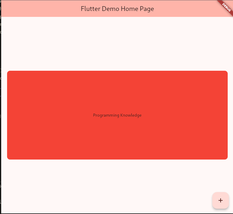
Its a convenience widget that combines multple properties for widgets inside it
-
The container in Flutter is a parent widget that can contain multiple child widgets and manage them efficiently through width, height, padding, background color, etc.
-
Container is a Single-child layout widget. But it can have multiple children by using a Multi-child layout widget as its child. https://docs.flutter.dev/development/ui/widgets/layout#Multi-child%20layout%20widgets
-
in case of BoxConstaints widget, maxheight cant be less that minheight
-
Padding is a conviennance widget of Container so we can replace Container with Padding if we need to use padding property only
part 1
     body: Center(
          child: Container(
              // color: Colors.red,
              padding: const EdgeInsets.only(
                left: 10.0,
                right: 20.0,
                top: 30.0,
                bottom: 40.0,
              ),
              decoration: BoxDecoration(
                color: Colors.red,

              ),
              child: Text('Programming Knowledge'))),
part 2
 body: Center(
          child: Container(
              // color: Colors.red,
              // padding: const EdgeInsets.only(
              //   left: 10.0,
              //   right: 20.0,
              //   top: 30.0,
              //   bottom: 40.0,
              // ),

              constraints: BoxConstraints(maxHeight: 300, minHeight: 100.0),
              width: double.infinity,
              height: double.infinity,
              padding: const EdgeInsets.all(10.0),
              margin: const EdgeInsets.all(20.0),
              decoration: BoxDecoration(
                color: Colors.red,
                // shape: BoxShape.circle,
                shape: BoxShape.rectangle,
                borderRadius: BorderRadius.circular(10),
              ),
              child: Center(
                  child: Text('Programming Knowledge',
                      textAlign: TextAlign.center)))),
ImageAssets with Frame Builder
- Before using assets we need to configure it in
pubspec.yaml
# The following section is specific to Flutter packages.
flutter:
  # The following line ensures that the Material Icons font is
  # included with your application, so that you can use the icons in
  # the material Icons class.
  uses-material-design: true

  # To add assets to your application, add an assets section, like this:
  assets:
    # - assets/20241110_122305.jpg
    - assets/
then
body: Image.asset('assets/20241110_122305.jpg', height: 100.0, width: 50,
  frameBuilder: (
		// buildcontext returns parent context
		BuildContext context,

		// represents image
		Widget child,

		// frameindex, useful for gif and videos as framerate is changing
		int? frame,
		bool wasSynchronouslyLoaded,
		) {
		return Container(
		  padding: const EdgeInsets.all(100),
		  decoration: BoxDecoration(
			color: Colors.red,
			shape: BoxShape.circle,
		  ),
		  child: child,
		);
	},
),
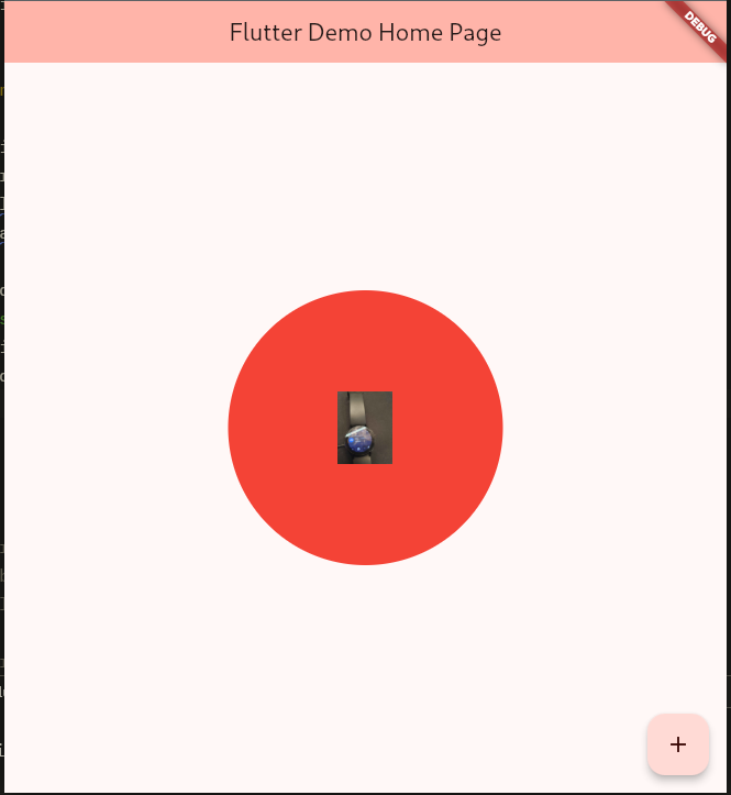
- framebuilder is a container around image anyway. in order to not use it do following
 body: Center(
	child: Container(
	  padding: const EdgeInsets.all(100),
	  decoration: BoxDecoration(
		color: Colors.red,
		shape: BoxShape.circle,
	  ),
	  child: Image.asset(
		'assets/20241110_122305.jpg',
		height: 100.0,
		width: 50,
	  ),
	),
  ),
All about images
- fit : like in html cover,fill values https://api.flutter.dev/flutter/painting/BoxFit.html
  body: Container(
	height: double.infinity,
	width: double.infinity,
	child: Image.asset(
	  'assets/20241110_122305.jpg',
	  // fit: BoxFit.cover,
	  // fit: BoxFit.fill,
	  fit: BoxFit.scaleDown,
	  // fit: BoxFit.fitWidth,
	  // fit : BoxFit.fitHeight
	),
  ),
Different fits
Fill
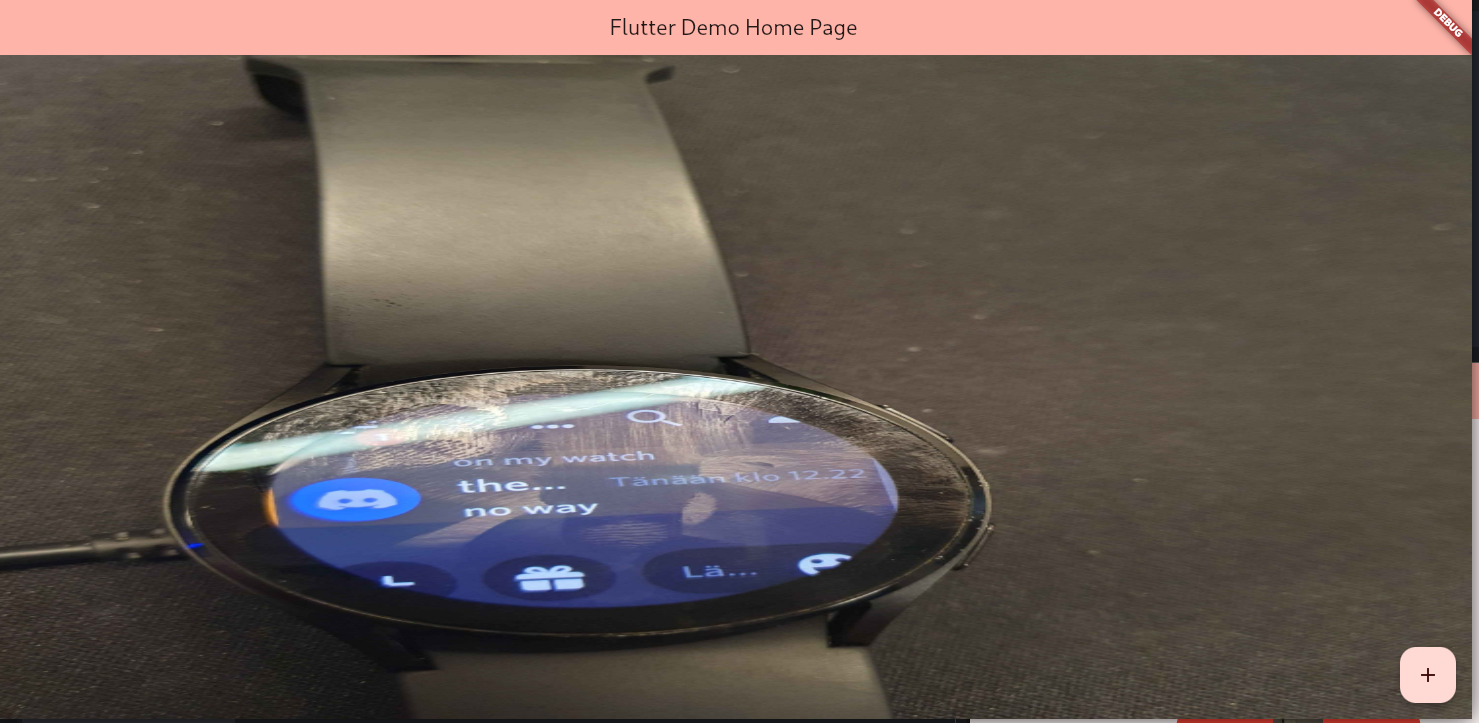
Cover and fitWidth
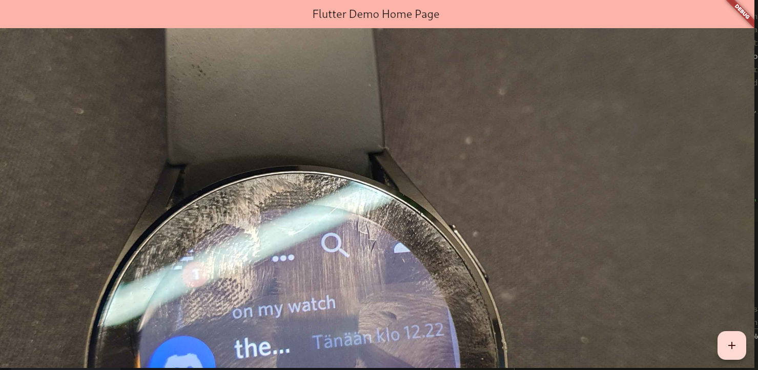
ScaleDown and fitHeight
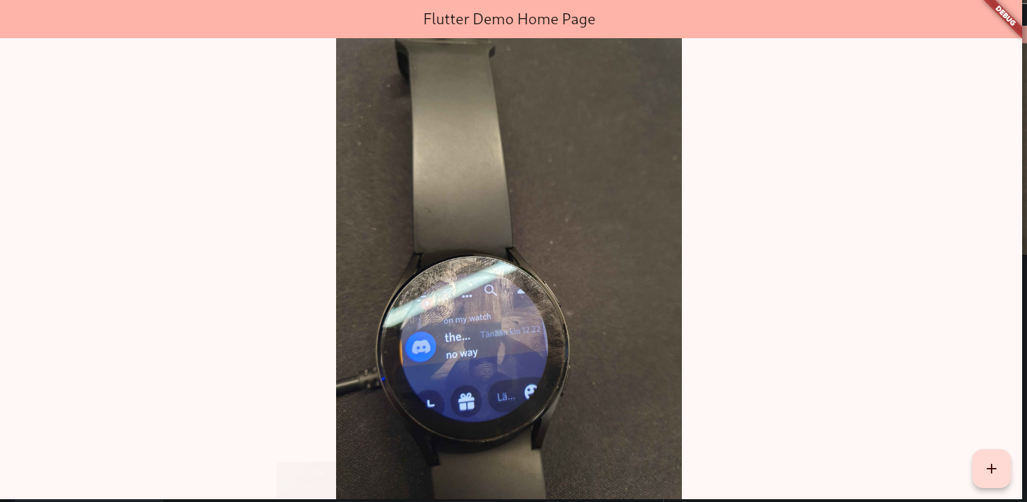
Expanded Widget
- to take the rest of space
Expanded(
	  flex : 2,
    child : Image.asset('asset/img/coffee_bg.jpg',
        fit : BoxFit.fitWidth,
        alignment: Alignment.bottomCenter,
    )
)
https://www.flutterbeads.com/flutter-widget-size-in-percentage/ : for alternatices of expanded
SingleChildScrollView Widget
- to have scrollbar
- in order to use it for partilcular container make sure that container once wrapped by SingleChildScrollView must also be wrapped by expanded something to allow to expand itself for more width/height.
   body: Column(
        // crossAxisAlignment: CrossAxisAlignment.start,
        children: <Widget>[
          Expanded(
            flex: 1,
            child: Center(
              child: Videoplayer(
                  url:
                      'https://user-images.githubusercontent.com/28951144/229373720-14d69157-1a56-4a78-a2f4-d7a134d7c3e9.mp4'),
            ),
          ),
          lyrics != null
              ? Expanded(
                  flex: 1,
                  child: Container(

                      // height: 200,
                      margin:
                          EdgeInsets.symmetric(horizontal: 16, vertical: 32),
                      child: Column(
                          crossAxisAlignment: CrossAxisAlignment.start,
                          children: [
                            Container(
                              margin: EdgeInsets.only(bottom: 20),
                              child: Text('Lyrics',
                                  // textAlign: TextAlign.end,
                                  textAlign: TextAlign.left,
                                  style: TextStyle(
                                    color: Theme.of(context)
                                        .colorScheme
                                        .inversePrimary,
                                    fontSize: 20,
                                    // backgroundColor: Colors.grey,
                                  )),
                            ),
                            // Scrollable part with a single Text widget
                            Expanded(
                              child: SingleChildScrollView(
                                child: Text(
                                  lyrics,
                                  // style: TextStyle(fontSize: 16),
                                ),
                              ),
                            ),
                          ])),
                )
              : Container(),
        ],
      ),