
5.1 KiB
Extras
- with
npx tailwindcss init --fullwe can have full configuratio of properties available attailwind.config.jsand we can add some properties with their values too like
here under fontSize we added mammoth so when we type// in theme fontSize: { mammoth: ["10rem", { lineHeight: "1" }], xs: ["0.75rem", { lineHeight: "1rem" }], sm: ["0.875rem", { lineHeight: "1.25rem" }], base: ["1rem", { lineHeight: "1.5rem" }], lg: ["1.125rem", { lineHeight: "1.75rem" }], xl: ["1.25rem", { lineHeight: "1.75rem" }], "2xl": ["1.5rem", { lineHeight: "2rem" }], "3xl": ["1.875rem", { lineHeight: "2.25rem" }], "4xl": ["2.25rem", { lineHeight: "2.5rem" }], "5xl": ["3rem", { lineHeight: "1" }], "6xl": ["3.75rem", { lineHeight: "1" }], "7xl": ["4.5rem", { lineHeight: "1" }], "8xl": ["6rem", { lineHeight: "1" }], "9xl": ["8rem", { lineHeight: "1" }], },text-mammothin html we will get font-size as 10rem with line-height of similar size(10 rem in this case). - instead of directly modyfying full tailwind.config.js we can do same with empty one which is created without using
fullflag./** @type {import('tailwindcss').Config} */ module.exports = { content: ["./public/**/*.{html,js}"], theme: {c extend: { colors: { primary: "#FF6363", secondary: { 100: "#E2E2D5", 200: "888883", }, }, }, }, plugins: [], };
in html
<ul>
   <li
   	class="text-blue-900 font-bold text-xl p-4 m-4 border-2 border-solid border-gray-400"
   >
   	<a href="#">
   		<span>Home</span>
   	</a>
   </li>
   <li>
   	<a href="#">
   		<span
   			class="bg-secondary-100 text-secondary-200"
   			>About</span
   		>
   	</a>
   </li>
</ul>
- custom fonts
in src/style.css import the font with CDN like this
then in tailwind.config.js add this@import url(https://cdn.jsdelivr.net/fontsource/fonts/nunito:vf@latest/latin-wght-normal.woff2);
finally in html/** @type {import('tailwindcss').Config} */ module.exports = { content: ["./public/**/*.{html,js}"], theme: { extend: { fontFamily: { body: ["Nunito"], }, }, }, plugins: [], };<body class="font-body">this will add the font 'Nunito' - @apply Directive just like mixin in sass we can use apply directive to inherit the properties of other classs in src/styles.css
@import url(https://cdn.jsdelivr.net/fontsource/fonts/nunito:vf@latest/latin-wght-normal.woff2);

@tailwind base;
@tailwind components;
@tailwind utilities;

.card {
    @apply relative bg-white rounded overflow-hidden shadow-md;
}

.badge {
    @apply bg-secondary-100 text-secondary-200 text-xs uppercase font-bold rounded-full p-2 absolute top-0 ml-2 mt-2;
}
in public/index.html
<div class="card">
	<img
		class="w-full h-32 sm:h-48 object-cover"
		src="img/stew.png"
		alt="stew"
	/>
	<div>
		<span class="font-bold">5 Bean Chili Stew</span>
		<span class="block text-gray-500 text-sm"
			>Recipe by Mario</span
		>
	</div>
	<div class="badge">
		<span>25 mins</span>
	</div>
</div>
to fix bluish nature when using gray do this
const colors = require('tailwindcss/colors')

module.exports = {
  theme: {
    extend: {
      colors: {
        // This overrides 'gray' classes to use the flat 'neutral' color palette instead
        gray: colors.neutral,
      },
    },
  },
}
-
Tailwind components https://merakiui.com/components https://daisyui.com/ https://demos.creative-tim.com/soft-ui-design-system/presentation.html https://www.hyperui.dev/ https://daily.dev/blog/10-free-tailwind-css-ui-kits-and-component-libraries-2024 10 Free Tailwind CSS UI Kits & Component Libraries 2024 (15_3_2025 11_21_40 pm).u.zip.html
for !important use this
ml-auto to !ml-auto
tailwind group eg:
    <div class="group bg-blue-200 p-4">
        <p class="text-blue-800 group-hover:text-red-500">Hover over me!</p>
        <button class="bg-gray-300 group-hover:bg-green-500">Click me</button>
    </div>
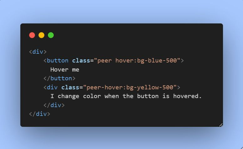
tailwind peer class
The peer class in Tailwind CSS is a modifier used to style an element based on the state of its sibling elements. Group allows child elements to react to the state of their parent
Peer allows an element to react to the state of its sibling.
  <div class="pill">
    <input type="checkbox" class="peer hidden" name="che1" id="che1" >

    <label for="che1" class="max-w-[300px] opacity-50 peer-checked:opacity-100 cursor-pointer hover:opacity-80 border border-gray-500 items-center gap-1 bg-gray-200 text-gray-800 rounded-full px-2.5 py-0.5 text-sm" >
      <span class="whitespace-nowrap  truncate  ">
        rockdsadsadsd  dsa ssafdd fdssdfsadsa  sds sd dsf dfd fds  rockdsadsadsd  dsa ssafdd fdssdfsadsa  sds sd dsf dfd fds

      </span>
    </label>


  </div>
to increase specificity
using [&&] or [&]
<div class="m-10 border border-slate-200 [&&]:border-rose-500">Foo